A landing page is a single, dedicated website page that is crucial to furthering your digital marketing efforts. Landing pages are usually the destination for PPC and similar campaigns, and their sole purpose is to encourage a lead conversion. Below we have picked out some of the best landing page examples for you to take a look at.
Why are landing pages important?
Many marketers choose to use PPC links to direct people to the homepage of their website. This, however, is limited in its ability to convert. Imagine a scenario where a user clicks through to a homepage of a site: that’s useful enough, but you’re leaving it to fate as to what the user does from that point. They may decide to browse the site and convert naturally, but this is unlikely. A landing page seeks to eliminate confusion and specifically direct the user to an action – for example, to submit their personal information or sign up to a service.
What makes a good landing page?
A good landing page is stripped back and basic; it should seek to provide just enough information to encourage the desired user action, and nothing more. Removing anything that could cause a visitor to leave your site for example social media links.
With this in mind, we have put together a list of great landing pages, so you can see how the principle works in action.
Some of the Best Landing Page Examples:
Squarespace
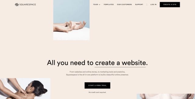
Squarespace’s landing page is a perfect example of the need to keep a landing page sparse. The page is open, easy to read, and is clearly directing the user towards a specific action – which, in this case, is to start a free trial. There’s no long explanation of what Squarespace is or what it does; a few sentences is sufficient to make the point, and two calls to (the same) action are highlighted in black to help draw user attention.
Muzzle
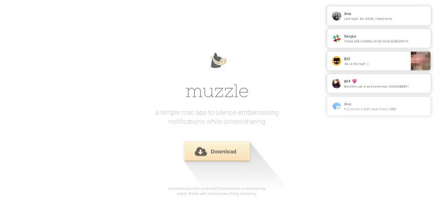
Muzzle is an app that allows users to silence potentially embarrassing screen notifications when they are sharing their screen. Their homepage is a great landing page example, the sole purpose of this landing page is to encourage people to download, so the call to action is front and centre, standing out from the blank white background. A brief description is included, as well as an active example of the kind of notifications Muzzle can help to silence. It’s simple, effective, and the user is naturally directed towards the “Download” button – just as the designers intended.
nDash
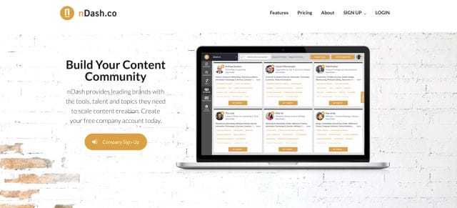
nDash are a content resource for businesses, and their landing page is simple and effective. If people wish to obtain more information about the service, the menu bar in the top right is easy to find. However, the key focus of the page is on the call to action – “Company Sign Up” – which, along with a brief description of the service, is where the user’s eye is naturally drawn.
Codeacademy
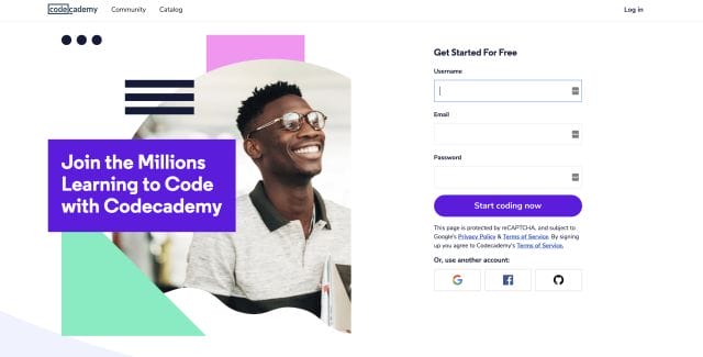
This design assumes that anyone landing on the page will know what Codeacademy is and what they offer – and even if they don’t, the simple “join the millions learning to code…” text is an explanation in and of itself. This landing page is a great example of brevity of information; tell people what the service is, then provide an immediate route for them to get started via the online form. Users can scroll down and browse if they wish to do so, but this section of the page fills the initial screen, and clearly encourages the user towards an action – there’s even a blinking cursor in the “username” box, just for an extra attention-grab.
Fiverr
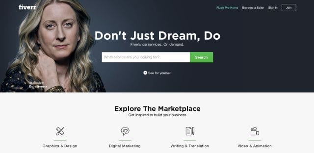
Fiverr’s landing page features a more unique call to action; directing users to immediately search their services database rather than signing up. For Fiverr, however, it’s easy to see why this would be effective. They know that, in most cases, the users landing on their page will be seeking to hire the services of a freelancer. These users are likely willing to register an account, but they will, first and foremost, want to know if the service they require is offered on the available. If Fiverr were to use a signup call to action here, many users would exit the site, unwilling to go through a long signup process without even being able to verify if their required service is available. Fiverr understand this, and while they do provide a sign up link on their landing page, their primary directive is to the services section.
Interflora
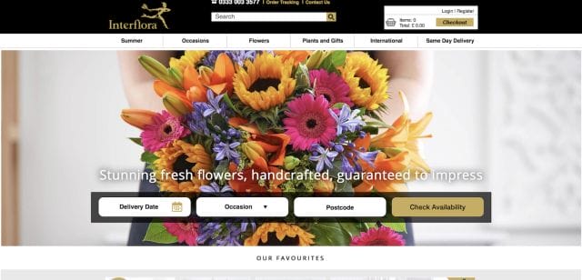
Why does someone visit a website that allows you to organise a flower delivery online? Because they want to send flowers. As a result, Interflora have eschewed a long sales patter – or even a particularly in-depth description of their service – and focused instead on the core basics. Users are immediately able to input their requirements through the three central boxes, which is backed by a beautiful photograph to emphasise Interflora’s expertise in this area. There’s more information if users wish to scroll down, but for users in a hurry, everything they need to make a purchase is right there from the moment they land on the site.
Netflix
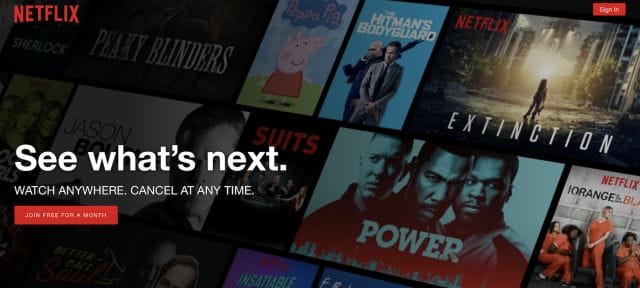
We have mentioned a few times now that landing pages should be simpler – and, frankly, they don’t get much simpler than the Netflix page. This page is focused on the signup; with two calls to action highlighted in red, and less than 20 words needed to make their point. If you scroll down, there’s actually another call to action, along with a reassertion that users are signing up for a free trial. It’s not an interactive, exquisitely designed landing page, but it doesn’t need to be: its role is to convert and, considering Netflix continue to go from strength to strength, it achieves this with aplomb.
Push Doctor
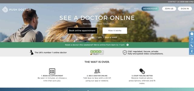
On initial inspection, Push Doctor’s landing page seems to miss the base requirement of a landing page; it’s cluttered with information rather than simple and streamlined. However, Push Doctor have likely noted that their users are likely to want more information. After all, their service is designed for people who wish to “see” a GP online; a practice that few people are familiar with. In this instance, providing more information is understandable, and there’s still the simple “book online appointment” call to action there to draw attention from those who are ready to proceed. A particularly interesting inclusion on this landing page is the “Next Appointment Time” section; we checked, and this genuinely does update to reflect the availability:
This a nice touch that ensures users are always provided with the most accurate, up-to-date information about their service.
In conclusion
The landing pages above are great examples of the power of this vital SEO tool. Hopefully, they will serve as inspiration when it comes to creating the landing page for your business or service.
