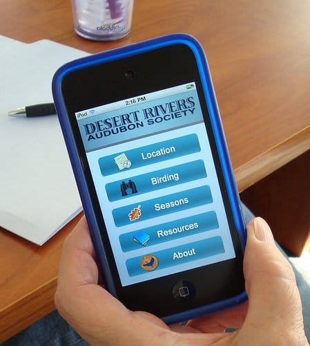
Optimising your website for mobile viewing is so important in this day and age. More and more people use their mobiles to browse the internet every day, with some people even shunning traditional computers and laptops to browse on their mobile device exclusively! This means that your site should meet the needs of mobile browsers perfectly. However, the amount of people that seem to forget that they are optimising for mobile is actually surprising. A mobile viewer most probably doesn’t care in the slightest about your company motto or press releases…they want the important information, easy to access, FAST. But don’t worry – there are some extremely simple ways you can optimise your website for mobile viewing; read on to find out more…
Choose a Responsive Theme
A responsive WordPress theme will change your site layout to fit mobile devices. Using a platform such as WordPress you’ll be able to choose from a load of responsive themes to give your viewer the ultimate user experience.
Use Mobile Redirects
Once you have these in place, your viewer will automatically be re-directed to the mobile version of the site. Remember to still give your viewer an option to view the full site – they might want information not included on the mobile site!
Plan Your Site Layout
It’s very important that you keep the number of pages on your site to a bare minimum, as the more pages you have the longer it will take to load and the viewer will get bored. You want your layout to be as streamlined as possible so your users have the best experience.
Incorporate The Same Branding Elements
Although your mobile site will have much less information than your normal site, you still want to incorporate the same branding elements. You still want your mobile site to reflect you as a brand, and your visitors to be familiar with you as soon as they click on.
Avoid Flash and Java Like the Plague
Newsflash: Apple products have no intention to support Flash ever. 30% of the market for smartphones are iPhones, so it’s important that you cater for them. Many phones don’t support Java either, and even when they do, your load time will surely increase. Hide these elements altogether, or replace them using HTML – but only if you need to!
Maximise Screen Display
When you compare a mobile phone with a laptop or desktop, the screen size is significantly smaller. This means you need to maximise screen display and use all of the space you have efficiently for the best results. You need to really simplify everything and hide unnecessary images and content. You’re definitely going to want things like a store locator and your contact information on display, but things that have lots of information and fields to fill out should be left to the desktop site.
Test it Out!
Before you launch the website, it’s a good idea to test it out so you get a good idea of how well it will perform. Opera Mini and YSlow are great tools for free testing!
It’s really that simple to optimise your website for mobile viewing. Good luck!

